Tutorials

Tutorial Center
Welcome to the UserLogos Tutorial Center!
Tutorials are step-by-step guides on how to create logos or backgrounds to then share with others on this site. Any user with the "Contributor" role is able to post a tutorial.
If you have any questions that aren't covered here, either e-mail us or drop by the forums.


Looking for help?
Are you looking for help with something not covered on this page?
Check out the Help Center.
- 8 votes
Photoshop

- 6 votes
Creating Refelective Logos - Photoshop

Creating Reflective Logos [ Page v1.0 ]
Hello all! Its finally here! The tutorial many have been waiting for..
There are 3 distinct ways creating logos - no matter what software you use..
It all depends on the source and type of the image you will use for the logo.
Transparent PNG, SVG - Wikipedia, the Site itself, Search Engine(Google Images)
JPG, GIF - The site itself, Search Engine(Google Images)
ANY - Custom
Choose one of the following(refers to the source/type of image):


- 2 votes
Transparent PNG or SVG
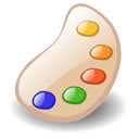
In this tutorial, i will be using wikipedia as the source for a transparent PNG of the YouTube Logo.
As long as you have a transparent png to work with, your source doesnt matter.
If you already have the transparent PNG you will be using, please skip steps 1 - 3. Start at 4.
1. Go to wikipedia (or your chosen source), and find the image.
Parts a-b apply to wikipedia..
a) Search for the site name

b) Once on the correct wikipedia article, click the image.

c) On the next page, Right Click the image, and click "View Image"

2. Once you have the image open, Right click, and choose "Save Image As.."

3. Choose a folder to save the image to, and hit Save.
4. Now you can go ahead and open the image in Photoshop.
You can either open photoshop first, then use File - Open.
Or, you can right click the image on your PC, and use "Open With"

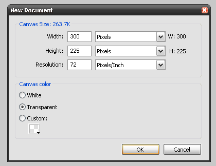
5. Go to the "Image" Menu, and choose "Canvas Size..".

6. Use the following settigs: Width - 300 pixels, Height - 225 pixels
Or, you can also use 400px by 300 px. (Ratio must be 4:3)

7. Now go to the "Edit" Menu, and choose "Free Transform".

8. While holding SHIFT, click and drag one of the corners to resize the logo.
Continue moving, and resizing it until it fits in the center of the canvas.
Then hit ENTER.

9. You can choose to remove certain areas of the logo. Select the "Rectangular Marquee Tool" (Shortcut = M key)
Click and drag it around an object you want to get rid of, then hit DELETE. I will get rid of the youtube slogan in this case..

10. When done deleting un-necessary objects, right click anywhere on the image, and choose "Deselect".

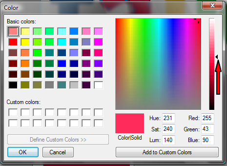
11. Now look below the layers pallete, and find the "half-moon" icon. Click that, and choose "Solid Color...".

12. Choose pure black. Code: 000000

13. Repeat Step 12, but this time choose pure white. Code: ffffff
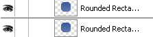
Make either one of them invisible, by clicking the "eye" icon to the left of the layer (I have made the white one invisible).
The white and black layers help you see how the logo will look on dark or light backgrounds.
You can switch visibility between the two at any moment during the tutorial. Use the "eye" icons.
Arrange the layers as seen in the screenshot below (You can click and drag layers..):

14 - 15 OPTIONAL
14. Right click the Logo layer, and choose "Blending Options.."

15. In this tutorial i will give the logo an outer glow for better visibility of the black "YOU" part.
Most of the settings are self-explanatory. Play around if you don't know what they do. When done, hit Ok.

16. Right click the Logo layer, and choose "Duplicate Layer.." Hit Ok on the pop-up.

17-18 ONLY If you followed 14-15
17. Create a new layer, move it underneath the duplicate logo layer.
"New Layer" icon is found under layers pallette, between the "Folder" and "Trash" icons.

18. Select the Duplicate Logo layer, go to the "Layers" menu, and choose "Merge down".
This will merge the duplicate layer, with the blank layer, which will "rasterize" the blending settings..

19. Now go to the "Edit" menu, then "Transform", and choose "Flip Vertical".

20. Use the "Move Tool" (Shortcut = V key), using the arrow keys to position the flipped logo underneath the non-flipped logo.

21. Make sure your current primary color is set to black. Select the "Gradient Tool" (Shortcut = G key), Give the Flipped Logo layer a "mask".
The "Create Mask" icon is to the left of the "half-moon" icon under the layers pallette.
In the top left of the toolbar, choose the "Foreground to Transparent" gradient.
Now click about halfway down the flipped logo, and drag your mouse straight up, about halfway up the non-flipped logo, then release the mouse.

22. You can continue to use the graient tool until you get the logo to look similar to this:

23. Now select the thumbnail of the flipped logo layer. Choose the "Filter" menu, then "Blur", and choose "Gaussian Blur".

24. Move the "Radius" meter until you get the desired effect. Hit Ok when done.
25. The logo is complete!! Use the "eye" icons located to the left of each layer to switch between the black and the white background layers.
This gives you a preview of the logo on a dark or light background.
26. Make both solid color background invisible (again, use the "eye" icons).
Go to the "File" menu, and choose "Save As.."
27. Browse to a desired save location. Select the "PNG (.png)" Format, and give the logo a filename. Then hit Save.

NOTE: You may also want to save as a "Photoshop (.psd)". This way you can modify the logo later. All layers are preserved in the PSD format.
Videos: Web 2.0 Style Logos - Photoshop
ctach1991's Reflections Tutorial - Adobe Photoshop
Thank You For Using my Tutorials!

ctach1991's UserBars Tutorial - Adobe Photoshop.
Here's the Link to the Logo I Used in the Tutorial.
http://planetrenders.net/renders/albums/userpics/252179/normal_KingdomHe...
Here's the Link to the Font that I Used in the Tutorial.
http://www.dafont.com/visitor.font

GIMP

- 7 votes
Creating iPhone App Style Logos - GIMP
I’ve noticed that there isn’t a tutorial for iphone logos for ‘gimp’ so I decided to make my own. I used http://userlogos.org/node/5487 as a base to create one for gimp. Well let’s begin…
Step #1
Open up gimp and make a new image with a size of 125 pixels by 125 pixels.

Step #2
I always find it easier to make the logo if I am zoomed in. This is optional but I suggest you zoom in to 400%.

Step #3
Next right click on the image and click add alpha channel. This will allow you to make your iphone logo transparent.

Step #4
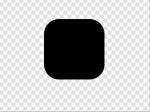
Next hit the delete key on your keyboard. Your image should now look like this…

Step #5
Click on the ‘rectangle select tool’

Step #6
Use the rectangle selection too to make a rectangle around your entire image. It should look something like this.

Step #7
Click ONCE in the center of the image

Step #8
Now go to Select>shrink and click on shrink.

Step #9
A box should appear that asks you how many pixels you want to shrink it by. Put 15 in the box and hit enter.

Step #10
If everything went well you should now have this:
If you don’t have this go back to step #6

Step #11
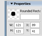
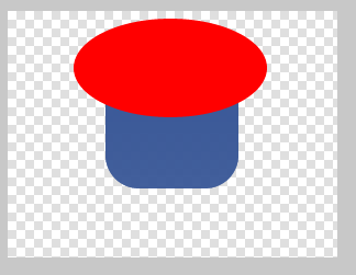
Now we are going to make the rounded corners. Click select, and then click on rounded rectangle.

Step #12
When you click on rounded rectangle a small box that ‘script-fu rounded rectangle’ should appear. Set the radius to 20% and then click ‘ok’

Step #13
You should now have a rectangle with rounded corners in the center of your page.

Step #14
Double click on one of the two colors. This will bring up a color selection screen.
Pick or make the color that you want and then click ok.
Double click on eh second color. Make this so it is slightly lighter than the last color.
Once you have both colors click ‘ok’ and move to step #15
For this demonstration I used the colors ‘0027d4’ and ‘0283d4’

Step #15
Click on the gradient tool.

Step #16
Click above the Image and draw a line from the top of the Image to the bottom. Tip: You have to keep holding the mouse button in order for this to work.
It should look like what I did below.

Step #17
Now release the mouse button and your image should be filled with the two colors you chose.

Step #18
Now let’s give the image a shadow.
Go to Filters>lights and shadows and then click on drop down shadow.

Step #19
A box should appear.
Set the offset X to 0, the offset Y to 4, and the blur radius to 5.
Now change the opacity to 40%, and click ok.

Step #20
Once this is done you should have a light shadow. It will get darker later on.

Step #21
Press ‘CTRL’ and ‘L’ on your keyboard.
A small window will appear.
Right now you should have two layers. A drop shadow and the background.

Step #22
Right click on the background later and duplicate it.

Step #23
You should now have three layers.

Step #24
On your keyboard type
‘CTRL’ + ‘A’
Then ‘CTRL’ + ‘X’
Then ‘CTRL’+’V’
After this has been done it should look like this:

Step #25
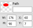
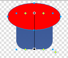
Click on the ellipse tool.

Step #26
Try to center the ellipse with the center of the image.
Once you have drawn an ellipse click into the center of it.

Step #27
Click on the paint bucket.
Then change the color that is on top to white.
And change the threshold to 255.

Step #28
Now paint the inside of the ellipse white.

Step #29
Now go to the layers box and change the opacity to 20.

Step #30
On your keyboard type ‘CTRL’ + ‘M’
Then click merge.
This will make it so there will be only one layer.

Step #31
Change the view back to 100% and you should have an iphone button just waiting for a logo.
----------


Drop Shadows - GIMP
A tutorial for users who don't know haw to make drop shadows.
Step #1
Paste the logo that you are making into GIMP

Step #2
Then go to light and shadow and click on drop shadow

Step #3
A window will open.
For more advanced drop shadows you can fiddle around with these settings but for normal logos just click ok.

Step #4
And there you have it…

GIMP: How to make an outer glow
Make an Outer Glow in GIMP
What you need:
- GIMP 2.6
- Transparent PNG
Method A (Faster, easier)
1. Open the file.
2. Go to Filters>Light and Shadow>Drop Shadow.

3. Change the X and Y offset to 0.

4. Change the color to white (or the color you want your glow) and click OK.


5. Go to the Layers dialog (Ctrl+L) and click on the Drop Shadow layer. Press Ctrl+Shift+D until the glow looks right.

Method B (More options, more confusing)
1. Open the file.
1a. If the logo comes close to the edge of the frame, increase the image and layer size using Image>Canvas Size and adding 100px to the height, centering it, and going Layer>Layer to Image Size.
2. Go to Layer>Transparency, and click on "Alpha to selection".

3. Go to Select>Grow, and change the "1px" to "3px".


4. Go to Layer>New Layer, and make it the same size as the PNG.


5. If the layers dialog isn't open, press Ctrl+L on your keyboard.
6. In the Layers dialog, drag the "New Layer" below "Background".

7. Select the Paintbucket tool. Fill the selection with white (or the color you want your glow to be).

8. On the keyboard, type Ctrl+Shift+A.

9. In the menus, go to Filter>Blur>Gaussian Blur, and click OK.


It glows (:
Glass Text- GIMP
You will need this plug-in before doing this tutorial: layer-effects.scm
1. Open a new document with transparent background. Make your canvas fairly large to fit your text.
2. Set foreground color to 30abf4 (doesn't really matter because you'll colorize it later)
3. Select text tool and a nice fat font. I used Elephant at 120 pts.
4. Type and position your text where you want it on your canvas.
Cool newbie tip - cutting and pasting your text as a new layer will center it.
Merge your text down to your background.
Alpha to selection
Create a new transparent layer. On this new layer, Select>Shrink, 2 pixels.
Edit>Fill with BG color (white). Select, None.
Filters>Blur>Gaussian Blur >x:2, y:2
Layer mode>Overlay
Merge down.

Now for some texture
Script-Fu>Layer Effect>Bevel and Emboss>Inner Bevel. Set lighting degree at 42, leave others at default. You should have three visible layers now - your text layer, Bevel Light and Bevel Shadow. Image>Merge Visible Layers>Expanded as Necessary
Are you back to one layer? Good.
Filters>Map>Bump Map>Set your depth to 3, leave everything else alone.

Now, Alpha to Selection again. Select>Shrink 5 pixels. Select>Feather>Feather by 5. Hit Clear (Ctl + K) twice. Select>None.
Now we need to soften it just a bit. Grab your magic wand and click anywhere outside the text. Select>Invert, Filters>Gaussian Blur>2. Select>None.

It's time to texture the edges. Filters>Map>Displace> x:2, y:2. I could stop here, but it looks kinda boring.
Layer>Colors>Curves. Drag the line all the way down to the bottom of the grid. Your text should look black. Click on the line at the midpoint of each grid square and at each vertical line. You should have a total of 9 black dots. Grab the dots in the center of the grid square and drag each one to the top of the grid.

Click okay.
Now to get rid of the red lowlights. Easiest part of the whole thing. Click Colors>Colorize. You can stop right here with the default value, or play with the settings to get a more desirable color.
Here is a possible outcome:

How to "make [the logo] so that it looks like a box and it's edges fade" in GIMP
How to make userbars in GIMP
Userbars
It’s not exactly part of the logo making process but user bars are becoming popular so I decided to find out how to make them myself.
I’m going to assume that you know your way around gimp 2.6. (If there are people who want an easier tutorial I will simplify it.) Before you start the tutorial you will also need this font:
http://www.dafont.com/unlearned-bitmap.font?nb_ppp=50
Step #1
Most people have user bars with a height of 19 pixels and a length of anywhere between 300 and 400. For this tutorial I’m going to use 350.

Step #2
I suggest zooming in so go to View>Zoom>Fit Image in Window or Shift + CTRL + E.
Next decide what you are going to use for the logo for. I’m going to do a windows logo.
There are several ways to do this step.
You can have a solid color

You can have a gradient going across

Or you can have a gradient going down

It’s up to you.
Step #3
Create a new image that is 6 by 6 pixels

Step #4
Zoom in to 1600%
Also change the brush size to 0.01

Step #5
Now using the pencil tool draw 6 squares going from the bottom right hand corner to the upper right hand corner.
They can be any color but I find that white shows up the best so I would suggest it.


Step #6
Next save the file in “C:\Program Files\GIMP-2.0\share\gimp\2.0\patterns”
Name the file userbar.pat
Step #7
Go back to the window in which you where making the user bar.
On your keyboard hold Shift+CTRL+P
This should bring up the patterns dialogue.

Step #7
Click on the refresh button to refresh the patterns.

Step #8
Find the pattern that you made.
The white one will look like this:

And the black one will look like this:

Step #9
Create a new layer (CTRL+Shift+N) and then drag the pattern onto the image.
It should look like this:

Step #10
Open the layers box (CTRL +L) and change the opacity to 50%. If you want it darker or lighter adjust the opacity accordingly.

Step #11
Take the image that you want on your user bar and center it on the left hand side of the bar.

Step #12
Now for the words.
Create a new layer (CTRL + Shift + N)
Then find the font that you installed at the beginning of this tutorial. It should be called Unlearned 2 BRK
Change the preferences to the image below. (Turn off hinting and Antialiasing)

Step #13
Now create a new text bubble and type in your text. I like my word big so I went with size 16 but this is optional.
Try to center it in the middle of the right side.

Step #14
Now let’s change our font so it’s white.
Use the paint bucket and fill in the inside of the font.

Step #15
We’re almost there…
Use CTRL + M to merge all the visible layers.
Then duplicate the current layer. To do this right click on the background layer and click duplicate.

Step #16
On your keyboard type CTRL +A, CTRL + X, and then CTRL + V.
It should now look like this:

Step #17
Use the elliptical select tool to make the gloss.

Step #18
Use the bucket tool to fill it with white. Change the threshold to 255% and then fill in the ellipse.

Step #19
Now change the transparency to 20%

Step #20
Merge the layers by using CTRL +M
Step #21
Save the image and your done!
Make your own logo with Reflection - GIMP
http://www.howcast.com/videos/63947-Make-Your-Own-Logo-Reflection-Effect...
What was so hard about providing one of these?
Making Logos - Web 2.0 Style
- 2 votes
Manipulating existing logos - GIMP
A list of misc stuff to think about when using Gimp:
To get a logo from a site in Firefox:
Go to "Tools" and click on "Page Info".
Click on the "Media" tab.
In the list of pictures, look at each one until you found the logo (this one is Youtube).
Right click the location, and click "copy".

In the URL bar in Firefox, right click and click "paste".

Right click the image, and click "save".
Open it in GIMP.
----------------------------------------------------
Make a GIF (no alpha transparency) into a PNG:
Open the image. Press (Ctrl+A). Then press (Ctrl+Shift+V).
Save it as a PNG file.
----------------------------------------------------
Crop a logo to just the logo (ex., Youtube's logo):
With the select tool, select the logo.

Under "Image", click "Crop to selection".
----------------------------------------------------
To increase working size:
First increase the image size (under "Image") [:

Then, go to "Layer", and click on "Layer to image size".
----------------------------------------------------
Make a logo transparent:
In progress! Here is what I have so far:
Of course you start off with your alpha-enabled logo.
Using any kind of select tool, select the areas that are reflections, any non-logo part (that should still be there), etc.

Next, go to "Layers>Transparency>Color to Alpha".
Select the most common color (usually white).
Click OK.
----------------------------------------------------
Change the background on an existing, transparent logo:
My suggestion is to keep them transparent. But if you are sure you want a bg color:
To change the background on an existing, transparent logo simply click on the background (The white one:  ).
).
Select the color of your choice.
Then, go to "Layers>Transparency>Remove Alpha".
- 6 votes
Reflections- GIMP
Making reflections in GIMP
What you need:
- A transparent logo
- GIMP
1. Open the file.

2. Duplicate the layer.

A layer should appear in the Layers dialog:

3. Using the Move tool, move the new layer below the old one.

4. Flip the layer horizontally.

5. Rotate the layer 180 degrees.

6. Create a layer mask.

It should be all white.

7. Select the gradient tool, with the gradient as a White>Black.

8. Drag a gradient from the top of the lower logo to about the middle.

It should look like this:

9. Apply the layer mask.

10. Merge the layer down.

11. There should be one layer left. Save the file as a .PNG.

------------------
Make sure to rate!
Resizing logos to 36x36 for Blackberry using The GIMP
OK.
Resizing logos to 36x36 for Blackberry using The GIMP
First, open up your image in GIMP, going File > Open then navigating to the image:
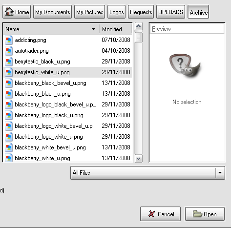
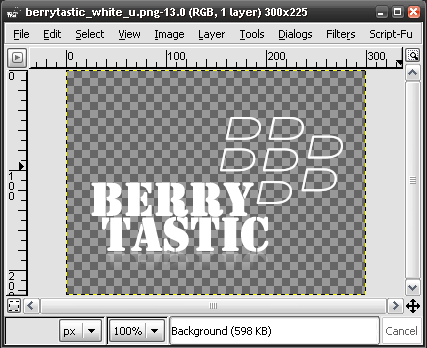
You should get something like this:
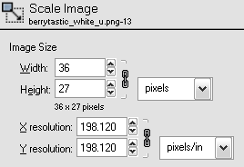
Find Image > Scale Image then select the following settings:
Then, find Image > Canvas Size and select the following settings:
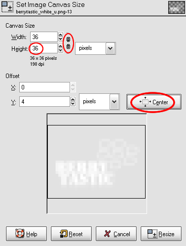
Make sure that the 'link' is broken and that you select 'center'
Then go File > Save As. Choose the location and file name and hit save, making sure it is saved as a .png
Select OK to the PNG settings page.
And you're done.
- 3 votes
Web 2.0 logo tutorial in GIMP | Урок создания Web2.0-лого в GIMP

Hello. Now I will write my tutorial for GIMP. On two languages: English and Russian. Line by line.
Привет. Сейчас я собираюсь написать свой урок по гимпу. На двух языках: Английском и Русском. Строку за строкой.
Я поделюсь своей технологией рисования логотипов стиля Web2.0 в гимпе.
I will share my technology painting Web2.0 style logos in GIMP.
1. Инструментом "Текст" напишите "GTranslate" в центре холста.
1. With "Text" tool write "GTranslate" in the center of the canvas.

2. Выделите текст по контуру (Правой кнопкой мыши по слою, пункт "Текст в выделение")
2. Select the text around the contour (Right-click on the layer, paragraph "The text in the selection")

3. Создайте новый слой (прозрачный), а слой с чёрным текстом текстом удалите.
3. Create new transparent layer. Delete layer with black text.
4. Инструментом "Заливка" закрасьте буквы по порядку: синий-красный-жёлтый-зелёный.
4. With "Fill" tool fill letters Order: blue-red-yellow-green.

5. Фильтры -> Свет и Тень -> Отбрасываемая тень.
5. Filters -> Light and Shadow -> Drop shadow.
Настройте:
Set up:

6. Создайте новый слой (прозрачный, в размер холста) и переместите его выше слоя с текстом.
6. Create a new layer (a transparent, the size of the canvas) and move it higher layer with the text.
7. Если у Вас ещё нет пака "130 вебдванольных градиентов", то скачайте его и поставьте.
7. If you do not have pack "130 vebdvanolnyh gradients", download it and install.
8. Выберите градиент "Grey Gloss#2"
8. Select the gradient "Grey Gloss#2"

9. Правой кнопкой по слою с текстом, "Альфа-канал -> Выделенная область".
9. Right-click on the text layer, "Alpha-channel -> selected area."
10. Создаём снова новый слой и закрашиваем градиентом выделенную область.
10. Create a new layer again and fill with gradient selected area.
11. Измените непрозрачность нового слоя на 71%.
11. Change the opacity of a new layer to 71%.

12. Правой кнопкой по любому слою, пункт меню "Объединить видимые слои". Ничего не меняя, жмите [Объединить].
12. Right-click on any layer, the menu item "Uniting the visible layers." Nothing is changing, press [Merge].
13. Слой -> Автокадрировать слой
13. The layer -> Crop layer
14. Создайте копию получившегося слоя.
14. Copy the resulting layer.
15. Инструментом "Перемещение" с помощью стрелок переместите слой (далее - "отражение") аккурат под оригинальный.
15. With "Move Tool" using arrows move layer (hereafter - "reflection") under the original.
16. Слой -> Преобразования -> Отразить по вертикали
16. The layer -> Transformation -> Flip Vertical
17. Подвиньте отражение ещё ближе
17. Move closer reflection
18. Поместите отражение в меню слоёв под оригинальный.
18. Put into layers under the original menu.

19. Правой кнопкой на слой, "Добавить маску слоя..."
Ничего не меняя, жмите [Добавить].
19. Right-click on the layer, "Add layer mask ..."
Nothing is changing, press [Add].
20. Инструментом "Градиент" (Из чёрного в белый) закрасьте маску слоя так, чтобы отражение уходило в полную прозрачность.
20. Tool "Gradient" (From the black to white) fill mask layer so that the reflection leaves in full transparency.

21. Щелкните по пиктограмме слоя, чтобы выбрать рисунок слоя, а не его маску.
21. Click on the layer icon to select a picture layer, not his mask.

22. Фильтры -> Размывание -> Гауссово размывание
22. Filters -> Blur -> Gaussian Blur
Установите радиус размывания так, чтобы отражение достаточно хорошо узнавалось, но и не было слишком чётким. Для такого маленького рисунка достаточно и 5, однако будь он побольше, понадобилось бы что-то около 9.
Set the blur radius so that reflected well enough to know but were not too clear. For such a small figure 5, but whether it is more, that would be needed something like 9.
23. Вот и всё, логотип готов.
23. That's all logo is ready.
UPD: Amend paragraphs 2 and 3. Advanced paragraph 24 was deleted.
ОБН: Изменены пункты 2 и 3, дополнительный пункт 24 удалён.
- Grawl's blog
- Log in or register to post comments or vote.
- 3 votes
plugin for GIMP
I found a cool plug-in in the plug in registry.
Anyone who wants to copy the "mac screen shot" effect will like it.
http://registry.gimp.org/taxonomy/term/124

Fireworks
- 1 vote
Black on Black reflection - Fireworks CS4
Reflections tutorial provided here thanks to: sjdvda
read first!
Allright, heres a little trick on how to make black-on-black reflections work in Fireworks CS4
Group your objects, copy-paste them, flip them vertically and position them where you want them to be.
Also Arrange the object "To back"
Complete the Commands - Creative - Auto Vector mask ( as described: Commands > Creative > Fade Image ) command and adjust the reflection until youre happy with it.
Now select Photoshop Live effects.
The effect you're looking for is "Outer Glow"
Set the color to White ( #FFFFFF )
Oppacity to 20 - 40% ( I set it at 25 - 30% )
Technique to softer
Size to 0 ( allthough we're using "outer glow" we dont want it to be visible outside the object )
Spread is also 0
Range to 100 ( this will make the glow soft )
Jitter to 0
Heres an example of what it looks like
With the effect: ( set to 50% so the change becomes noticable right away )
Without the effect:
Its a subtle difference which will make a huge change when put on the fast-dial page
Creating iPhone App Style Logos - Fireworks
Here’s how to make your very own iPhone App style logo::

This tutorial is primarily for canvases 300x225.
Dimensions for 400x300 canvases are in italics
Open Fireworks, then open a new document with the following properties:
(Or 400x300px)
Draw a standard rounded rectangle, with the following properties:
(W:161 H:16 X:118 Y:55)
Select Gradient > Linear.
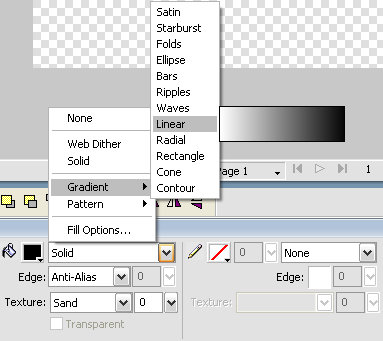
And select the following settings for the gradient:
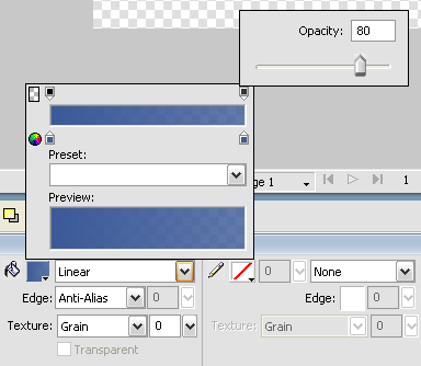
I've used blue as an example, but you can use any colour, but keep it the same along the gradient.
(Same colour throughout / Top opacity 100% Bottom 80%)
Here's how to make the gloss:
Duplicate the layer, by selecting the rectangle, then Ctrl+C then Ctrl+V
Now an ellipse with the following properties (Don't worry about colour at the moment):
(W:235 H:120 X:80 Y:9)
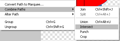
Select both the duplicated rectangle and the ellipse:
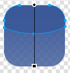
Now select Modify > Combine Paths > Intersect
You should end up with something looking like this:
Give the gloss path the following properties – Fill > Solid > White and Opacity 30%
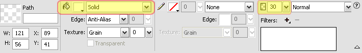
You should now have something that looks like this:

Next, paste the transparent logo you are wanting to make onto the canvas:

Select both the rounded rectangle and your icon for the logo, then hit Ctrl+Alt+2 then Ctrl+Alt+5 to centre it. You should get this:

Then simply add reflection and you’re done!
IPhone style logo with a bitmap fill (from template) - Fireworks
Here is how to make iPhone app style logos from the template using a bitmap as the logo "fill".
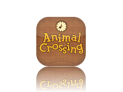
Example logo:
First thing, save macleod.mac's template to your hard drive and open it in Fireworks
Right-click onto the template and choose "Ungroup".
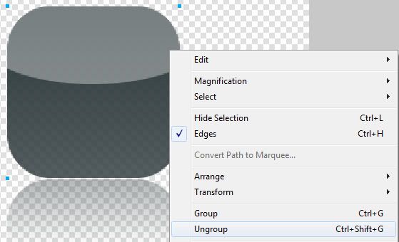
This will produce two new objects in the "Layers" pane
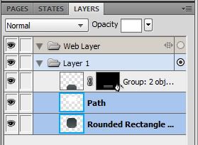
- a rounded rectangle (this is the overall shape of the logo)
- a path (this is the "gloss" covering the upper 1/3rd of the logo)
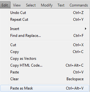
Select the rounded rectangle and Cut or Copy it (Ctrl+C or Ctrl+X on the keyboard or Edit -> Copy / Edit -> Cut)
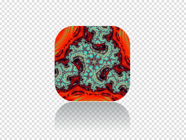
Import a bitmap onto the Canvas (or drag and drop one if it's easier for you), select it, go to the edit menu and select "Paste as mask"
The result should look like this:
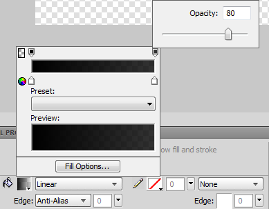
To achieve 100% opacity on the top and 80% opacity on the bottom do the following:
Use the pointer tool and choose the mask in the "Layers" pane.
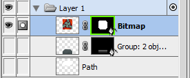
The green rectangle around the mask should appear if you made the right selection
In the Properties pane switch from "Path Outline" to "Grayscale Appearance".
This should create a "Vector Mask" like the one used when making reflections.
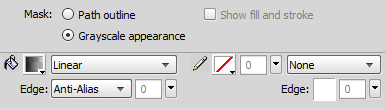
Click on the Gradient Fill, set both colors to White (#FFFFFF) but set the top right slider's opacity to 80%
Now just add the image you want to use in the logo, make sure you put the "gloss" path on top and there you have it:
a iPhone style logo based on macleod.mac's template with a bitmap as a background.
One tip:
There is a chain linking the mask and the bitmap together. Clicking on the chain will make it disappear:
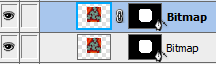
When the chain is not active you can freely move the bitmap or mask around (a blue rectangle around the bitmap should indicate that the bitmap is selected, a green rectangle around the mask should indicate that the mask is selected), in case you want to make adjustments (choose another spot on the bitmap, resize it, etc.)

Reflections Tutorial - Fireworks
Here's my first tutorial on UserLogos: Adding reflections in Adobe Fireworks.
Note: All RED items on the screenshots are not part of the actual picture, they indicate the steps to follow
(all images can be clicked to show larger versions)
This is the image I'll use for the tutorial, an non-centered sample logo with a transparent background (canvas size (400x300):

Steps to take:
1. Select the logo using the Pointer Tool(Keyboard Shortcut:V) by clicking on it:

2. With the image still selected go to the "Optimize and Align" section in the Fireworks window(By default it's on the top right). Select "To Canvas"(1), "Align Horizontal Center"(2) then "Align Vertical Center"(3):

3. The image should look like this:

4. Move the image about 10-15 pixels upwards using the "up" arrow key on your keyboard: (You should move it 7-9 pixels if you're using a 300x225 canvas)

5. Copy the image and paste it. You can either do this by selecting edit>copy and edit>paste or by pressing (Ctrl+C) then (Ctrl+V) on your keyboard. After doing this, lock the bottom(original) layer:

6. Right click the image and select Transfom>Flip Vertical:

7. The image should now look like this:

8. Move the flipped image to the bottom of the original layer using the down arrow key on your keyboard:

9. With the image selected, go to Commands>Creative>Fade Image:

10. Select this type of fade and click "OK":

11. You now have a logo with reflection, you can adjust the slider to experiment with different amounts of reflection:

(At this point, some people add a Gaussian blur to the reflection but I don't usually)
12. The finished image should look like this:

The Transparent PNG Version:

I've taken a lot of time and effort to make this tutorial so that everyone can add reflections to a logo. The best way to thank me for writing this is to make beautiful logos and post them on UserLogos! =]


Web 2.0 style fills in Fireworks CS4
First of all I have to say whay I love working with fireworks.
The main reason is because it is able to work with vector graphics (or paths as they're called in Fireworks)
Here I will explain how to create web 2.0 style fills manually (you can download style libraries from various sites and I have used them in the past, but they are uneditable) and fairly easy.
Let us start. First of all you have to trace out your logo from a bitmap or write down some text. right click on it and select "Convert to paths"
Here is my starting image

Of course each one of the letters is essentially a path
Next up select each path individually and in the live effects section select and add a "Photoshop Live Effect".
Select stroke, set the color to the fill color of each path and the following settings:
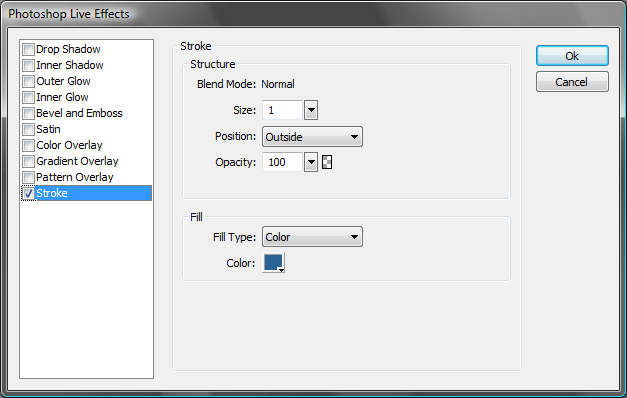
This adds an outline to the objects.
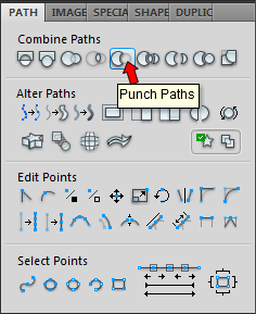
Then select all paths, duplicate them, remove the photoshop live effect from the newly created ones and draw a rechtangle in front of them.

You can use other shapes as well.
With all paths and the rechtangle selected, open up the path panel and select "punch paths"
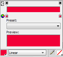
Select each of the newly created objects individually and create a gradient fill. The top color being white, and the bottom being the fill color of the original path.
You should get this:

Next select each of the original paths, set the fill to gradient.
First match the two colors
Then open up the system color picker on the first (upper) color (outlined in red)
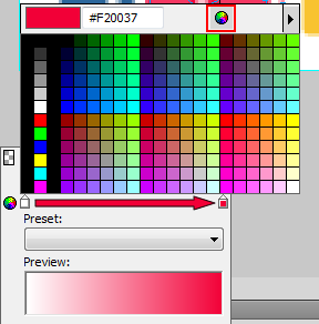
In the system color picker use the slider to select a lighter shade of the same color
The result should look like this:

You can try out different shades until you are happy with the result.
Now select the top objects, set their oppacity to around 40-50% (or play around until you are happy with the result)

Next up select ALL the objects on the canvas, duplicate them, group them, right click and select "Flatten selection" (this is a good practice when using Photoshop Live Effects, of any of the Live effects because when flipping Fireworks tends to keep effects settings as they are so shadows, glows, etc may not be flipped), flip the image and proceed to creating a reflection.
I also like to set the oppacity of the image to 80-90% before adding "Auto Vector Mask"
One trick for easy export to transparent PNG:
In the optimize panel set the image type to "PNG32", set the canvas color to transparent and press "CTRL+SHIFT+R" to bring up the "export" dialog.
And here is the finished product:

Have fun!
Paint Shop Pro
- 0 votes
Paint.NET

- 0 votes
Pixlr

- 0 votes
How to use the Pixlr Grabber Extension
In this tutorial I will be explaining how to use Pixlr Grabber, which is an extension for Firefox that supplements the free online editor Pixlr.
Background
This extension provides an easy way to 1) Take screenshots of websites, and 2) Easily edit any image online without having to open it in an external program.
Tutorial
Here's how to install Pixlr Grabber:
1) First, install it via this page:
https://addons.mozilla.org/en-US/firefox/addon/pixlr-grabber/ It works with Firefox 1.5-9*. Click Install, then restart Firefox.
 2) Once installed, you can access the screenshot taking options via a button on the toolbar, or the editing options via the right click context menu. *Important: To see the button, drag the pixlr grabber icon(The yellow G) to the toolbar from firefox's customize dialog *
 How to take a Screenshot:
1) Click on the button dropdown and select one of the options there. (I selected grab the entire page)
Note: If you click on the main part of the button it will go directly into the "grab a defined area" option.
How to take a Screenshot:
1) Click on the button dropdown and select one of the options there. (I selected grab the entire page)
Note: If you click on the main part of the button it will go directly into the "grab a defined area" option.
 2) Then a couple options to save or edit the capture will pop up.
 How to edit an image:
The best feature, I think of this extension is the ability to edit any image directly from the browser.
1) Right click an image, and select the edit image option:
How to edit an image:
The best feature, I think of this extension is the ability to edit any image directly from the browser.
1) Right click an image, and select the edit image option:
 2) It will then bring you to the pixlr online editor, where you can customize the image as much as you want.
 Also make sure to check out the options for Pixlr Grabber:

Thanks for reading!
The Easiest Way to make a Transparent Logo with a 4:3 Ratio
In this tutorial I will explain the easiest way to make a 4:3 ratio (compatible with Fast Dial) Transparent logo out of a different size transparent icon.
Note- This tutorial is only for transparent icons. For nontransparent icons, see the tutorials section of UserLogos.
Background
All right, say you have just created a dial on your Fast Dial that links to digg.com. Instead of the basic snapshot of the site in the cell, you want to make it look nicer with a digg icon you've found on the web. (See icon below)
![]()
But when you try to load it into the cell it stretches to fill the width of the cell and looks horrible. The reason this happens is because in Fast Dial versions 3.51 and up there is a limitation that allows for only logos of a 4:3 ratio to be correctly displayed. (In Fast Dial versions 3.51 beta1 and earlier, icons did not stretch if they were not 4:3 ratio) The digg icon I'm using has a *256X256 size (not a 4:3 ratio) so it stretches when I load it into the cell.

So the next step would be to somehow make into a 4:3(ex. 400X300) ratio without ruining the image quality.
Tutorial
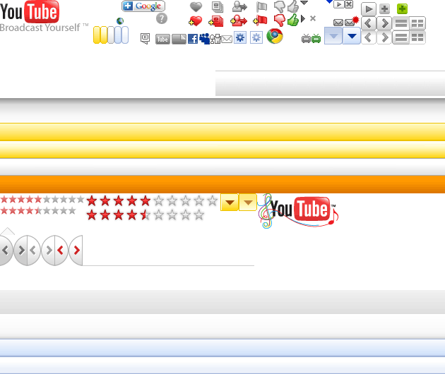
So here are the step by step instructions on how to make the 4:3 logo using an online tool called Pixlr Editor:
1) Go to http://pixlr.com/editor/ Select the option that says load image from url (or computer) (the digg logo's url is http://icons.iconarchive.com/icons/land-of-web/globe-social/256/digg-icon.png
2) Once the image is loaded, Look at the top strip, select Image>Canvas Size. Type in for width 400, and for height 300. Make sure to center the image by clicking the square in the middle. Click OK.
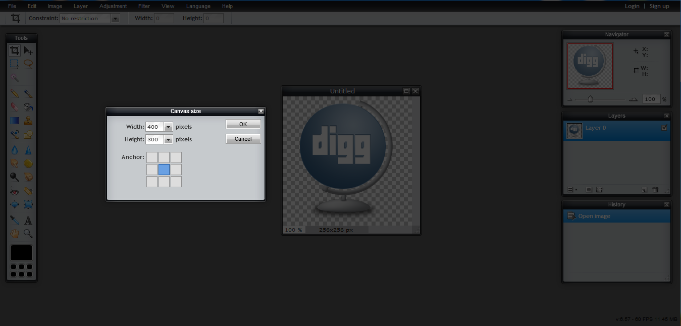
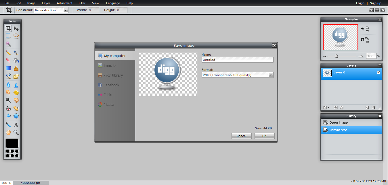
3) The image is now in a 4:3 ratio, now click File>Save, and make sure to save as a .png file. That's it!
Here's the result of loading the now 4:3 ratio digg icon into the cell: It's that simple:)

*Note: If you start with an image/icon that has a larger width than 400 pixels, or a larger height than 300 pixels, you will have to resize( or crop) the original image.
Here's how to resize an image so it will fit the required 4:3 ratio:
I'm using this 432x37 logo:

In this case I only need to resize the width, because its over 400. The height is fine. It's way lower than 300 pixels.
1) Go to the top strip, select image>image size, then reduce the width to 400, making sure the constraint proportions option is checked. (The resized image is 400x34)

2) Now that the width is 400 pixels, I repeat the steps from the first part of the tutorial to create a 400x300 image:

Final result:
